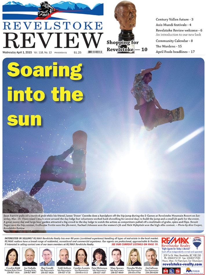
Welcome to the new look, new name Revelstoke Review!
First off — this isn't an April Fools joke. We don't have the resources to produce such a dramatic change to the newspaper as a one-time thing.
As of this week, the Revelstoke Times Review is now the Revelstoke Review. We've got a new logo and we're going back to the historic name of the newspaper because, quite frankly, the old logo was ugly and Revelstoke Review is a better, catchier name. It also makes for shorter e-mails and a shorter web address. Let's face it — Times Review was a bulky name, the result of a merger between the upstart Times and the legacy Review in 1992. When we told people our e-mail address, they often remarked how long it was.
Revelstoke Review is a shorter name with great alliteration and a long history in the community.
This is the first major re-design of the paper since 2006. There's been small changes since then, but they've all been done piecemeal.
The re-design was sparked by a desire to change the flag. I've never been a fan of the big, multi-font, blue logo that's adorned the front of the paper for the past six years. One of my first goals as editor was to change it, but that always takes time.
As the flag was being worked on, I brought up the idea of changing our name back to the Revelstoke Review, which was the name of the paper from 1914 to 1992. This had been raised before, but for whatever reason, our bosses at Black Press approved the change this time.
This change marks both a move forward and a move backward. Our new flag, designed by artist and cartoonist Rob Buchanan, with its train and mountainscape, reflects logos of the past, which prominently featured Mount Begbie. This wasn't intentional, but while doing a bit of research, I found out that one of the initial complaints of the old flag was that it didn't include Mount Begbie.
Meanwhile, I worked with Rob Stokes, our creative force, to change our fonts. The old collection had been built up over the years, the result being we had a motley and unwieldy collection of styles to work from. We wanted to reduced the dozen or so fonts used in the paper to three. There are thousands of fonts out there so this was not an easy task. It can seem like an exercise in futility as you debate the roundness of the letter 'B' in Futura as compared to Frutiger, and the benefits of serifs versus sans-serifs and slab-serifs. Some people revel in this stuff — I don't. (A serif is that little stroke at the end of a letter; a sans-serif eliminates those strokes.)
First, we chose the font for our body text — that's the font used for the bulk of the words in the paper, the ones you're reading right now. We settled on Chapparal Pro, which we felt had a more modern serif style compared to the classic Times font we were using.
From there, we stuck with Franklin Gothic to act as the complimentary sans-serif font, to be used in headlines, sub-headlines and wherever else it looks good. We've been using that font in headlines for a while and we like it — it looks good and it has several strong variations that make it very versatile. Lastly, we chose Bodoni, a strong serif font that works well for fancier text elements.
Once the fonts were chosen, we modified our layout items, like the photo boxes, section headers and bylines, to make them fresher. We're going with wider columns and you might see more white space here and there.
The end-result isn't a dramatic change but we hope the newspaper is cleaner and easier to read. This is the first issue with the new design, and we may find a few aspects that don't translate perfectly onto newsprint. We'll fix those as we discover them.
Before I end, I want to give thanks to Kiana Haner-Wilks, who works at the Kelowna Capital News. She took our designs and tweaked them to make them better, and provided valuable feedback on font choices. We also appreciate the help of local graphic designer Kathryn Whiteside, who came in for a morning to give feedback on our new layout in exchange for a coffee.
The Revelstoke Review isn't going anywhere. We're in our 118th year and we plan to keep going. We face the same challenges as newspapers everywhere, but we're still proud of our work, despite having fewer resources to work with. We're up for a Newspaper Excellence award at the BC & Yukon Community Newspaper Awards later this month, our subscriptions are up and our online page views keeps rising, so hopefully that means you think we're doing a good job.
We want to know what you think of the Review. What do you like and dislike about the new look? How do you feel about the content of the paper? Are there stories you'd like to see more of?
Let us know what you think. There's lots of ways to get in touch with us. You can come to our office at 518 Second St. West, call us at 250-837-4667, e-mail us (our e-mails are on the masthead to the left), comment on our website, post on our Facebook page, or tweet us on Twitter.
Check it out:
